Welcome to my AS Media Portfolio

Click the Play button for Introduction

Monday 29 March 2010

Final Product


Front Cover:


Contents Page:


Double Page Spread:


Friday 26 March 2010

Product Evaluation

Please click here to view my evaluation in WRITTEN FORMAT:
http://www.scribd.com/full/30860408?access_key=key-1xbyg6v24tg7dez7j0s9
In what ways does your media product use, develop or challenge forms and conventions of real media products?


How does your media product represent particular social groups?


What kind of media institution might distribute your media product and why?


Who would be the audience for your media product?


How did you attract/address your audience?


What have you learnt about technologies from the process of constructing this product?


Looking back at your preliminary task, what do you feel you have learnt in the progression from it to the full product?


Thursday 25 March 2010

Music Magazine Textual Analysis

‘Crank’ Music Magazine Written Comments from a Target Audience Focus Group

Age – 17
Gender – Female
1) I think teenage males are represented. They seem to be the ‘alternative’ social group, and represent the more indie style of music.
2) It’s not really similar to other magazines. Although it follows conventions, it still manages to look different.
3) I like the colours of it and the style of it, particularly the look of spray paint and detail in the corners.
4) I would not buy it because I believe it is not aimed at me as a reader, however, I could imagine it selling well to its target audience.
5) On the double page spread in the details section, the twitter is just twitter.com, which isn’t really detailing the twitter address. It could be written as something like @crankmag to ensure readers are taken directly to Crank's address.

Age-17
Female
1. The genre of music that is represented is more rock style, and the social group that is represented seems to be young males as there are photographs of young bands that might relate to the target audience.
2. The magazine is not similar to other music magazines as it has a different layout and the style is different to other magazines out there. Considering there are a few magazines with the same target audience and same style of music, it is unique and well thought out.
3. I liked this magazine, as it looks very professional and very well produced. I also liked the fact that there are advertisements for festivals and other bands. The font was also very professional.
4. I personally would not buy this magazine as I do not follow this type of music, but I have friends who like to listen and find out about this type of music and would like this magazine so they know what bands are up and coming and whether they are any good.
5. There were not any noticeable mistakes that stood out when I looked at this magazine.
6. One thing that could be added to the magazine would maybe be a fan review of the bands album so that other readers know if the band is worth listening to for their personal interest.

Male, 17
1. I think that the magazine represents an indie/alternative style of music. I think that it could appeal to both males and females, however it seems to be more focused on males.
2. It isn’t similar to any magazines that I’ve seen. It represents the same genre of music as many other magazines, however is very unique.
3. I liked the style of it; it is very eye catching and looks very professional. It is well laid out, and the double page spread is well written, using interesting, captivating language techniques.
4. I would buy this magazine as I feel that it would appeal directly to my taste in music, and I enjoy the writing styles combined with the interesting, unique design. Also, the price is affordable.
5. There were no mistakes evident throughout.
6. I feel that reviews could be added so that the audience will know what others think of the bands that have been mentioned.

Wednesday 24 March 2010

Saturday 13 March 2010

Target Audience Analysis Questions

1)Which parts of the magazine were you instantly attracted to and why?
2)Which elements of the magazine appeal to you?
3)How could the magazine design and use of language have been improved-what other elements would you add?
4)How would you make use of the interactive elements in the magazine?
5)How do you think the product develops conventions of music magazines and which conventions are preserved?
6)How do you think the design of the magazine reflects the target audience and the music genre it aims towards?
7)Do you think the price is acceptable for the content-which elements of the front cover would entice you to buy the product for this price, before looking inside?
8)How do you think the product could be marketed?
9)Where do you think the product should be made available to buy and how else could the audience access information about the magazine?
10)In what ways do you think the same brand could be expanded into other areas of the media?

Thursday 17 December 2009

Simple Concept for Band Album Artwork


In order to make my double page spread more elaborate, I have designed an artwork for my band's new album, using the name "Trespassers Will Be Shot!", which anchors to the band's style. I have designed an abstract background image, with various bright colours, then added it to the review section of my double page spread.

Progressive Music Magazine Double Page Spread Design


Progressive Music Magazine Contents Page Design


Wednesday 16 December 2009

Tuesday 15 December 2009

Music Magazine Unique Concepts

From my audience profile sheet, I have shown how the target audience for my magazine, 16-24 year olds living in the UK, often keep up with modern fashion and how many own technological equipment, with much of their personal attitude and lifestyle based around their opinion of music.

For this reason, I have decided to opt for a modern design for my magazine, using many metallic colours in the colour scheme, but using graffiti sytle effects throughout, emphasising that it is aimed at a younger age group. I have also decided to use slightly more sophisticated language within the magazine, keeping certain conventional language styles very similar (using specialised language that only a younger age group may use themselves to retain a sense of community and 'membership' to the magazine), yet making use of the gap in the market for a more sophisticated, modern magazine for young people.

Questions to ask a Target Audience about my Magazine

I have described some questions that I will ask my Target Audience while testing the product for the market:

1) Does the concept of a modern music magazine with slightly more sophisticated language appeal to you?

2) Does my colour scheme (Grey/Silver, Orange, Red) reflect the style of the magazine - would a brighter, more colourful design appeal to you more?

3) Would the possibility of winning tickets for a music festival entice you to purchase the magazine?

4) Do you think that interactivity is an advantage to the magazine, and would you like to get involved with the magazine in other forms of the media, online and on social networking sites?

5) Would you agree that the price is acceptable for the size and design of the magazine?

Icon Design

My original concept was to use a 'cog' design for my icon, anchoring to the magazine title 'crank'. However, I have decided to redesign the icon as I believe it does not match the style of the magazine, and will not have a punchy effect when on the shelves amongst competitors-brand identity is hugely important in the magazine industry. I then decided to use a simpler, clearer font style, which spread across the whole page, making the icon larger and easier for the audience to recognise amongst competitors, with bolder colours.


However, during the development of the magazine, I realised that the simplicity of the font reduced brand identity, and decided that the icon required a more unique font, with a background. I searched font styles online, and used 'VTKS Distress' as my magazine title font, as it anchors the magazine's 'house style' very well, and it is very prominent on the page.

I then edited the logo further, with a shadow to extend the text out of the page, making it more aesthetically pleasing, and more prominent on the page. I also changed the colour of the font to silver, which has connotations of being modern through technology, and relates to the unique concept of my magazine: to consider how modern technology has changed music and make use of it throughout the magazine.

Wednesday 9 December 2009

'Crank!' Music Magazine Audience Profile Sheet Mood Board


I have produced a mood board, presenting audience profile examples, promoting my music magazine, showing the audience type, and giving examples of products that the audience own/use regularly. I have presented the mood board with styles, colour schemes and fonts that correspond to the magazine's style.

Tuesday 8 December 2009

Music Magazine Flatplans


I have produced some flatplans for my music magazine design, incorporating image and text positioning and ideas for different content to add.


Front Page:

Contents Page:

Double Page Spread:


Music Magazine Audience Questionnaire Results

I have collected results from my music magazine questionnaires, in which I handed out 20 copies of the questionnaire, and recieved 4 online results from my online questionnaire.

I collected these results and entered them into pie charts, demonstrating the results visibly.


1)What is your preferred music genre?

The large number of people who prefer the indie genre of music, and my own personal preferance has enticed me to create an indie/rock music magazine.

2)How often do you read music magazines or other publications?
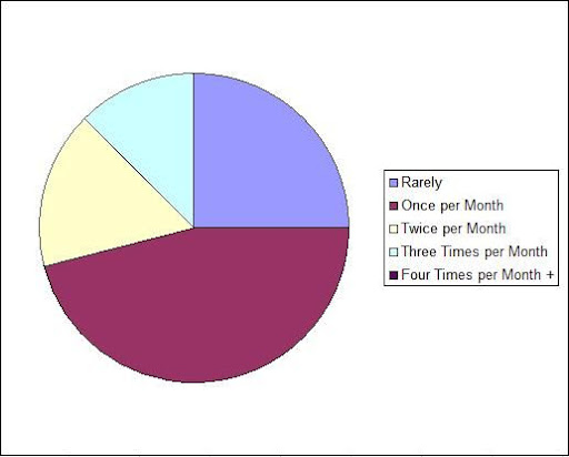
This shows that most of my target audience only buy magazines once a month, and I may therefore lose profit in the magazine industry if I were to publish the magazine more than once a month. Therefore I have decided to make the magazine monthly, and perhaps if the magazine were to become well established on the market, with commited readers, I could publish more frequently.
3)Do you own an iPod or other music player?
All participants of my market research have shown that they own technology that revolves around their devotion to music. For this reason, I have decided to give my magazine a modern, technological style.
4)On average, how often do you attend music concerts per year?

5)How much would you be willing to pay for a monthly music magazine?
From these averages, I have decided to price my music magazine at £1.99: a price that most of my target audience would be willing to pay for the magazine, while making enough revenue to cover the printing costs of producing a colour printed magazine.
6)Would a pre-release album review interest you in a music magazine?
This view of my target audience has persuaded me to include an in depth album review within my music magazine.
7)Do you regularly use social networking websites?
The high percentage of users of social networking sites reinforces my decision to create a technology-orientated magazine, with many updates on websites such as twitter and facebook-the magazine will require these interactive elements in other areas of the media to survive on this competitive market.
8)How often do you listen to music each day?

9)Would you be more inclined to read a more interactive music magazine?
The high number of people that have shown their appreciation for interactivity within a magazine has enticed me to embed competitions within the magazine, with the chance to win prizes, and also include ways for readers to get their opinion out, and get in touch with the 'editor'.
10)Would you be more interested in the magazine if it contained longer articles, or more images?


These varied results have allowed me to make the decision of including a large number of images within the magazine, ensuring that it is well designed and aesthetically pleasing, but still including enough text to make articles interesting for the reader.

Monday 7 December 2009

Music Magazine Audience Questionnaire


I have designed a questionnaire, containing necessary questions, relating to my task, that will give me more information about my audience and help to decide which options to make about my target audience, and the style that I adopt for the magazine.

I also designed an interactive, online questionnaire, in order to gain more access to my target audience, advertising the links again on social networking websites and MSN messenger, to gain a wider variety of results, from my target audience, most of whom will regularly use this technology.
Link:
http://spreadsheets.google.com/viewform?formkey=dFZKQUFJZVRWbWlHNjVjR1B5ZEtOWVE6MA


I can then collect these results, which are automatically sent to me as a form, and use them as extra research information for my music magazine.

Tuesday 1 December 2009

Establishment of Youth Subcultures through Music Magazines


Music magazines have had a large role in the establishment of youth subcultures for many years. People’s personal tastes in music affect their ways of life, system of values and their morals, often changing many aspects in society, when many people have same opinion. These opinions are often dictated by music magazines, where a style of music can easily contribute to how someone dresses, acts and socialises.
In the 1960s, the youth movement of becoming a ‘hippie’ was spread around the world, and is often considered as having developed from the ‘psychedelic rock’ style of music. This had huge effects on society, where many of these people appealed for stopping war and believed in peace and respect for individual rights. Adolescents began the subculture, by trying to move away from stereotypes, inspiring new activities and past times, like psychedelic art, wearing unique, colourful clothing and protecting the environment.
More recently, music has continued to adapt opinions, often through the means of music magazines. Fans of particular bands often read a single issue of a magazine in order to find out about their lifestyle or current trends, however many people follow a music magazine more closely, where the producers have created a sense of community that the reader can be involved in, and can find out about latest releases or new bands in a similar music genre. All music magazines use tones that fit in with the music genre, and often the way that the bands of the particular genre act. For example, readers of ‘Kerrang!’ will conduct themselves in a similar manner to the ‘punk rock’ style bands, will wear matching clothing and will socialise with others with the same taste in music-creating a subculture.
Youth subcultures have been dictated largely by music magazines, due to the brand loyalty that is created for readers, and can have an impact on society and the reader’s ideology, persuading them to act in a certain way.

Wednesday 25 November 2009

Testing Photoshop - Front Cover Design Concepts

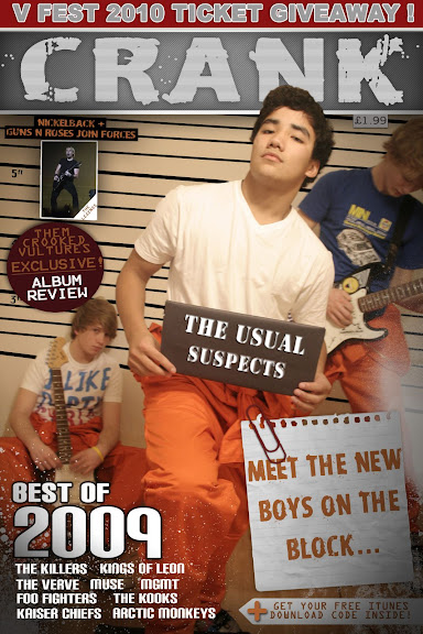
I have tested using some photoshop effects on some of my 'On Location' shots. I have tested certain font effects, including the 'Cogs' font, imported new brush effects, that give a 'Paint Spray' effect and I have also practiced with changing the contrast and brightness of the picture itself, whilst cropping it to fit into the front cover.

Tuesday 24 November 2009